CHALLENGE
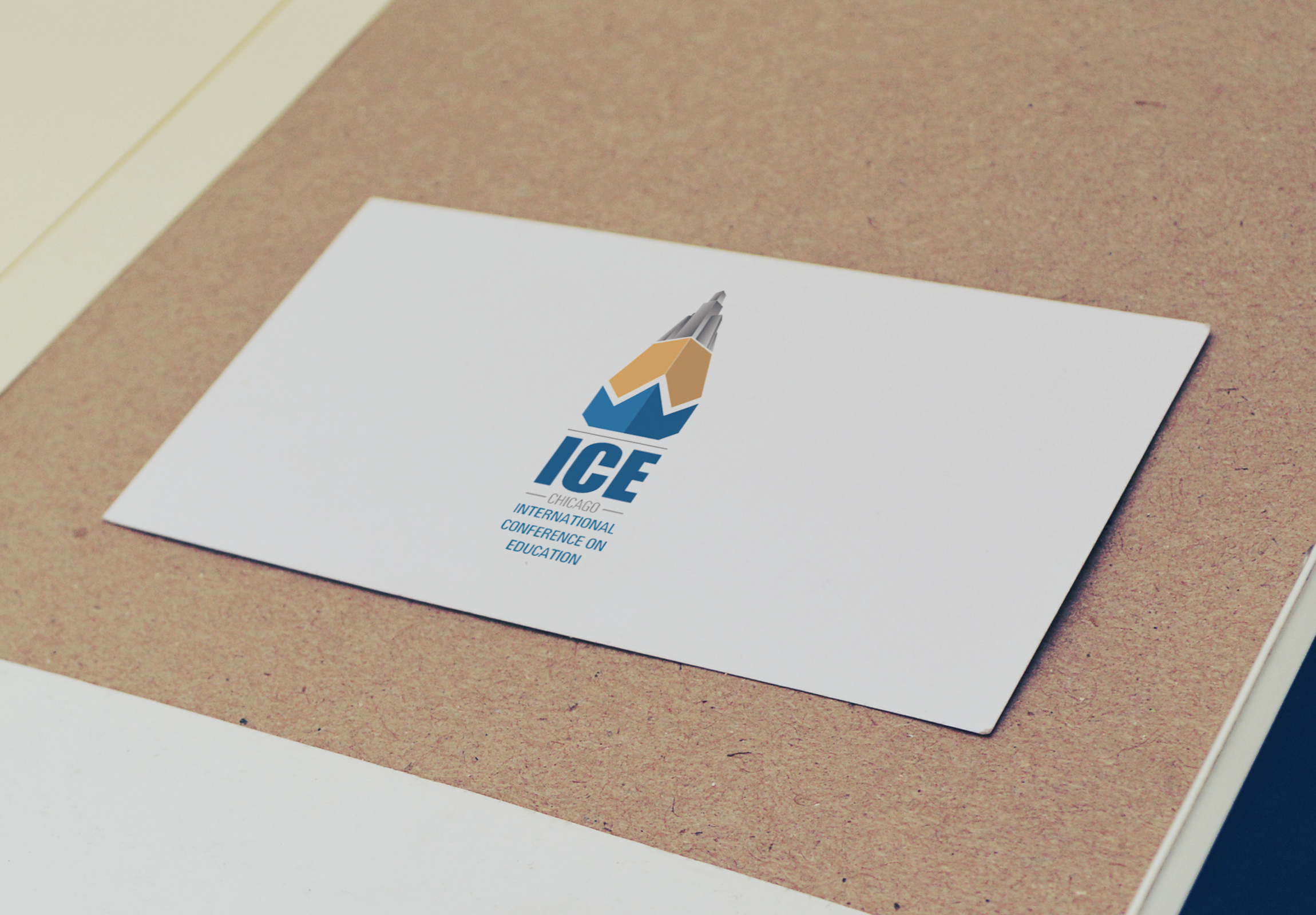
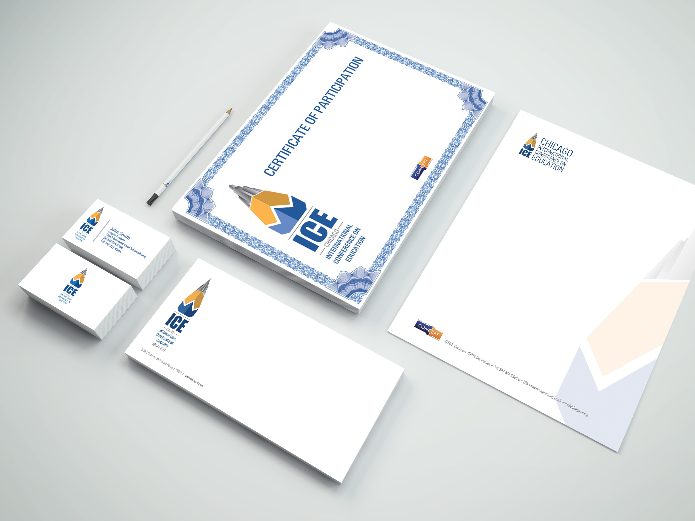
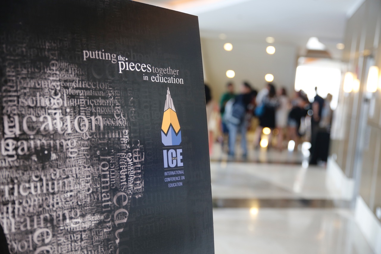
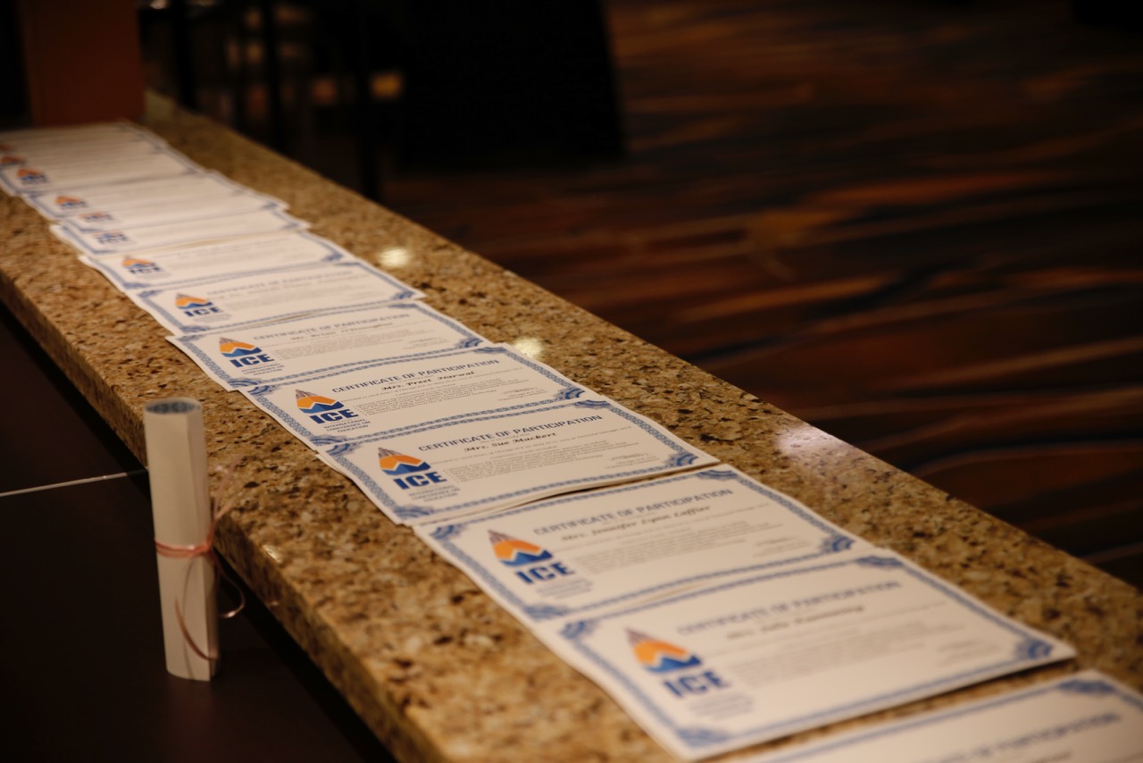
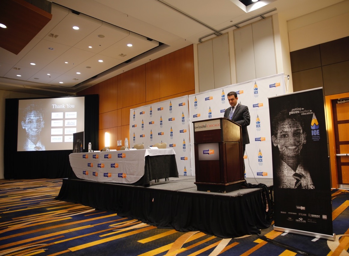
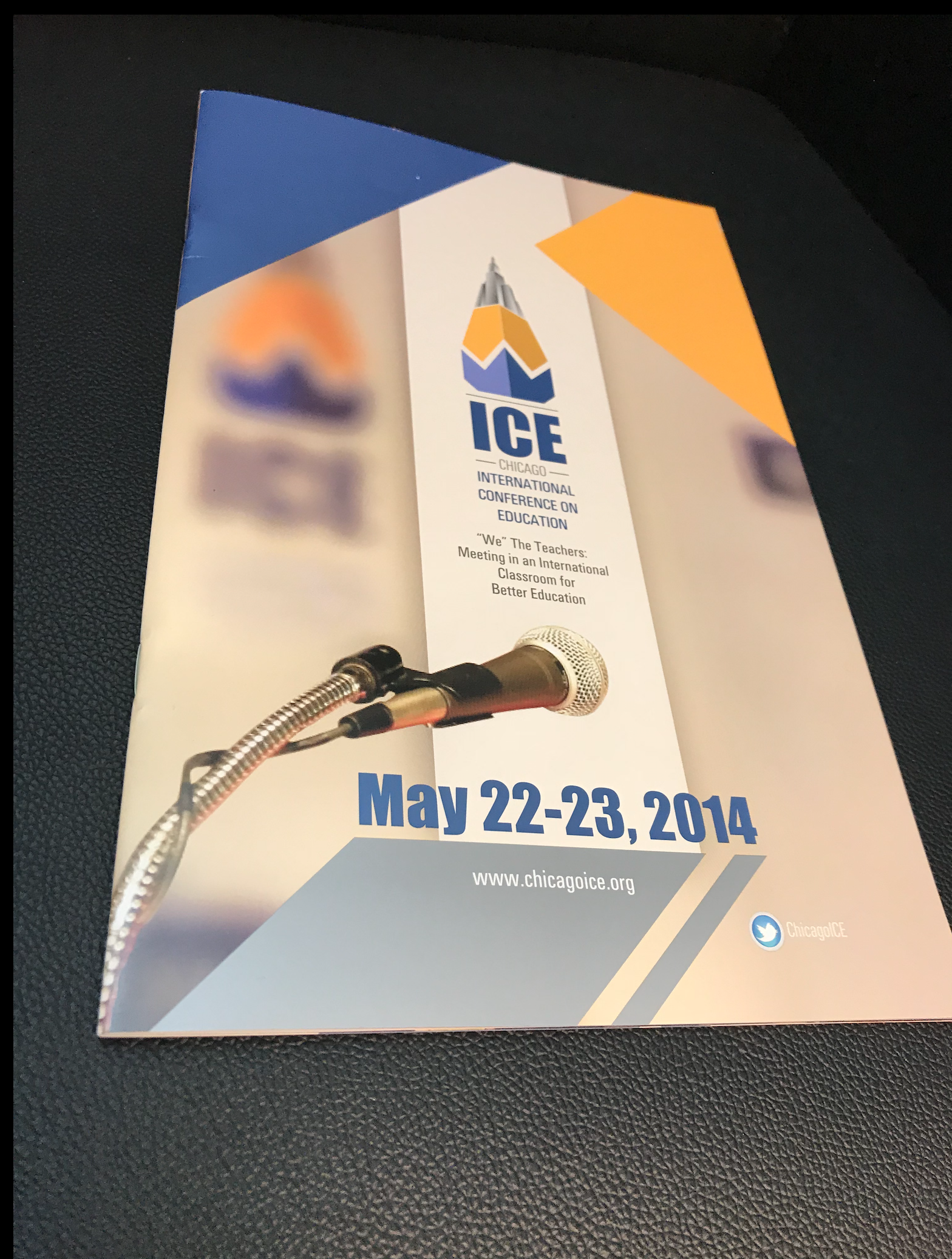
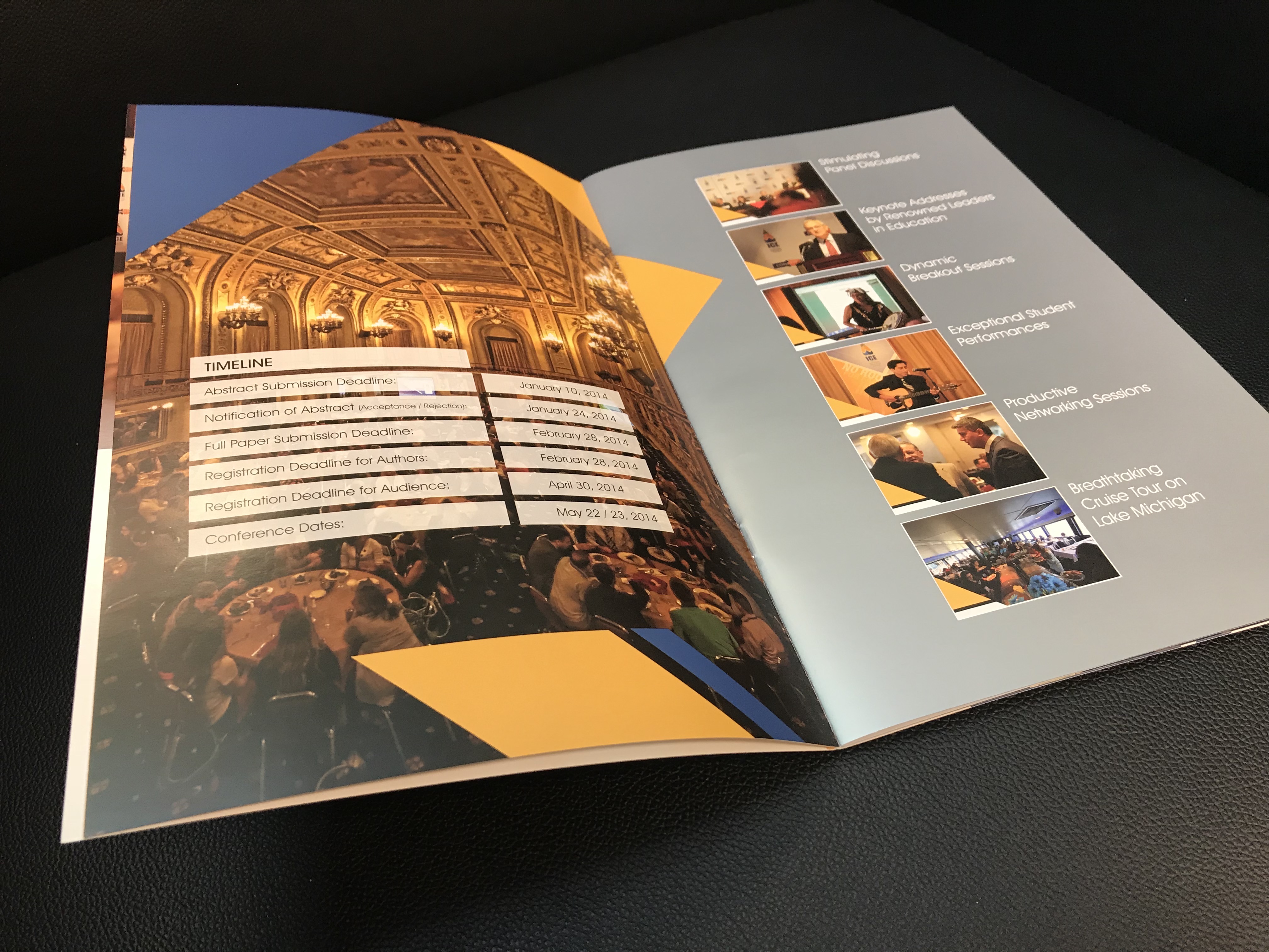
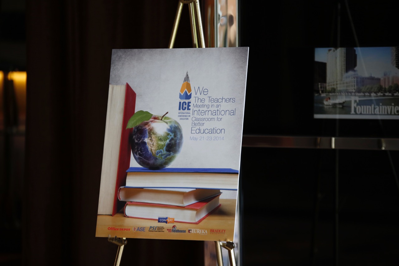
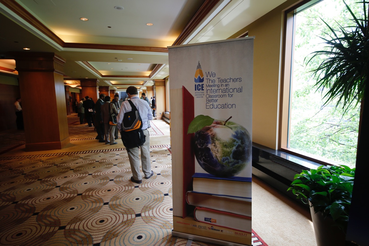
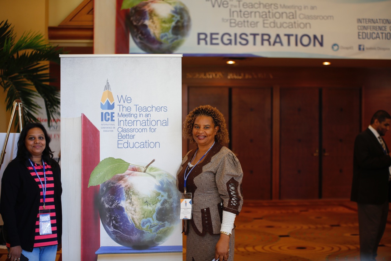
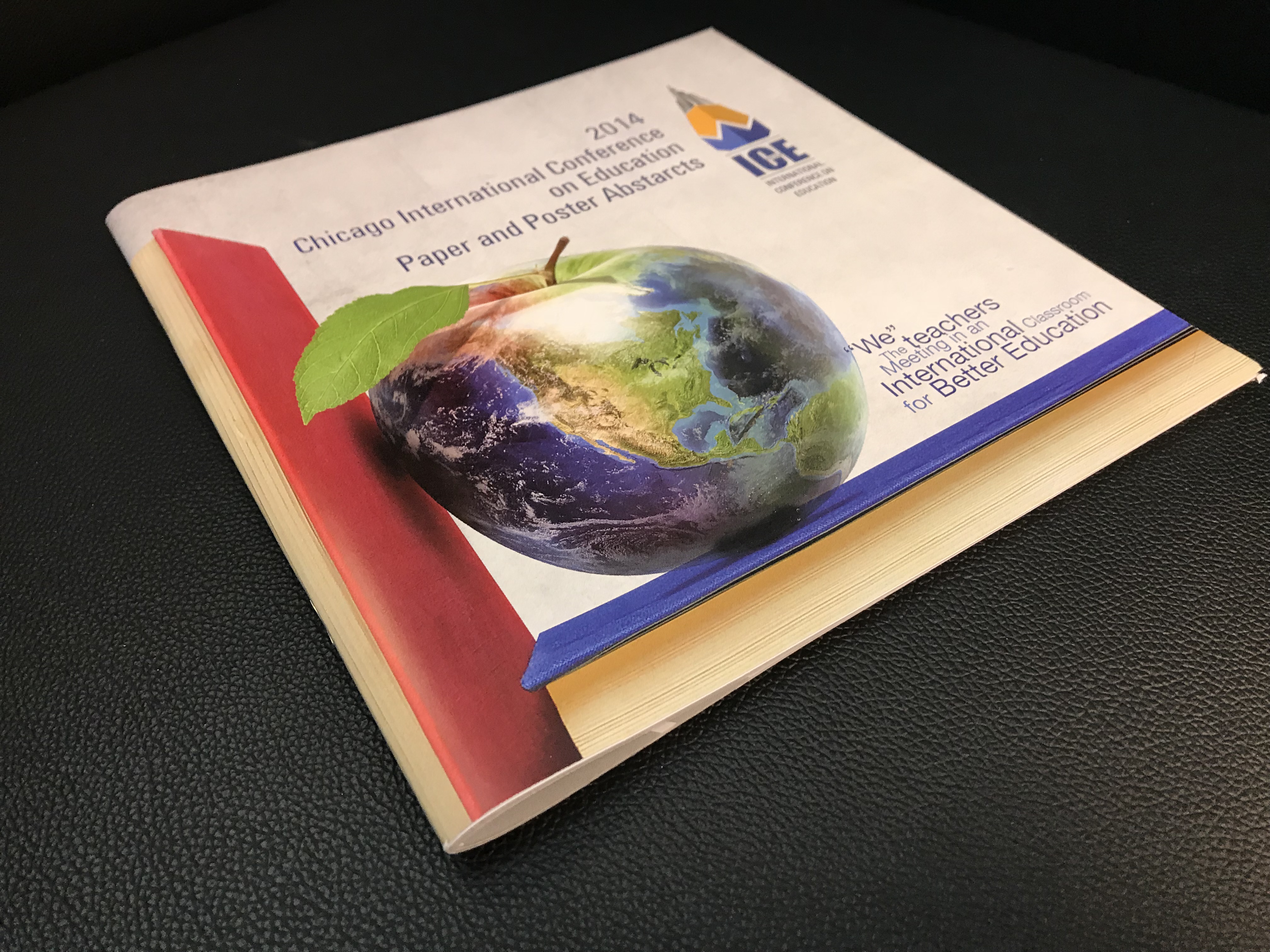
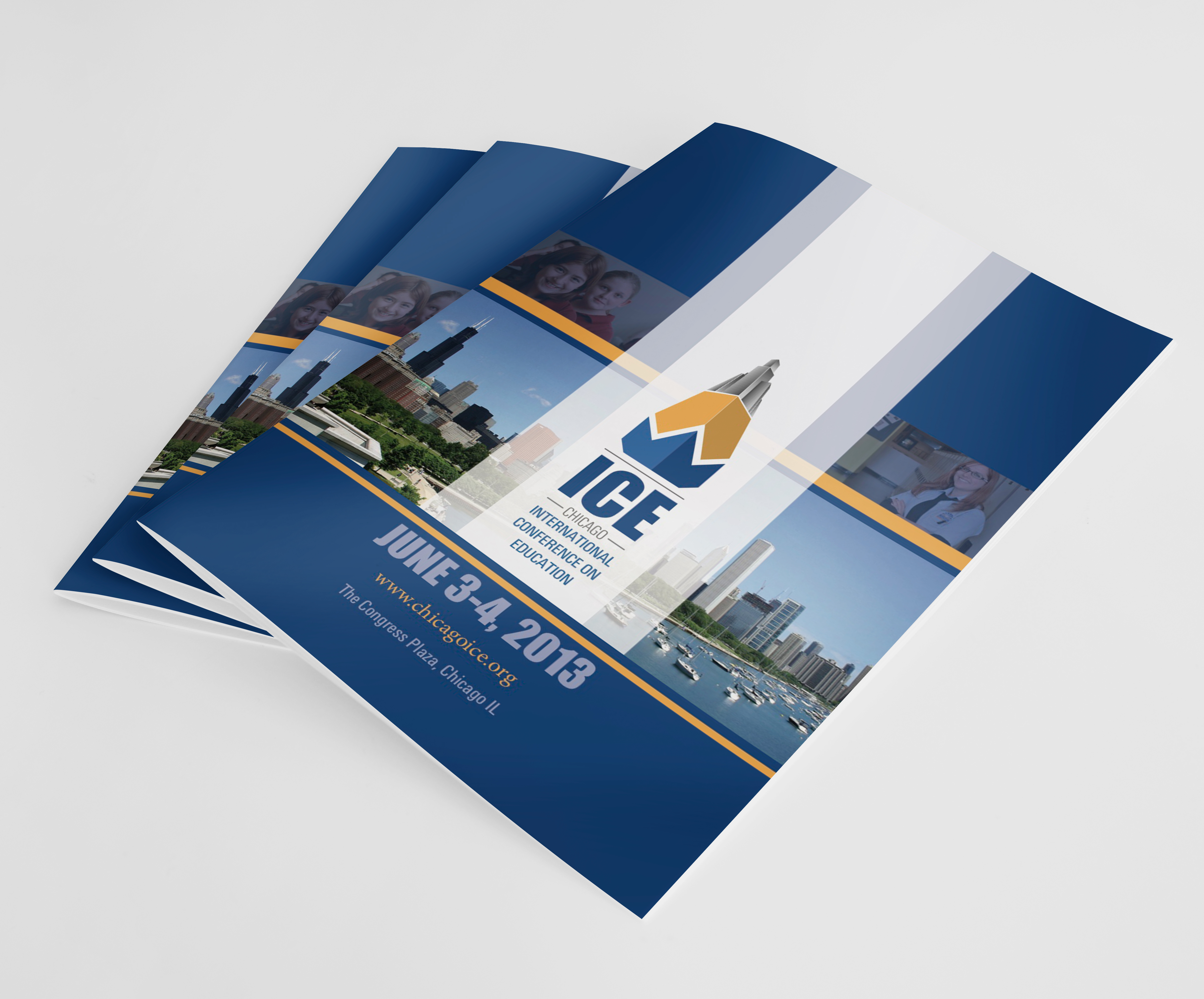
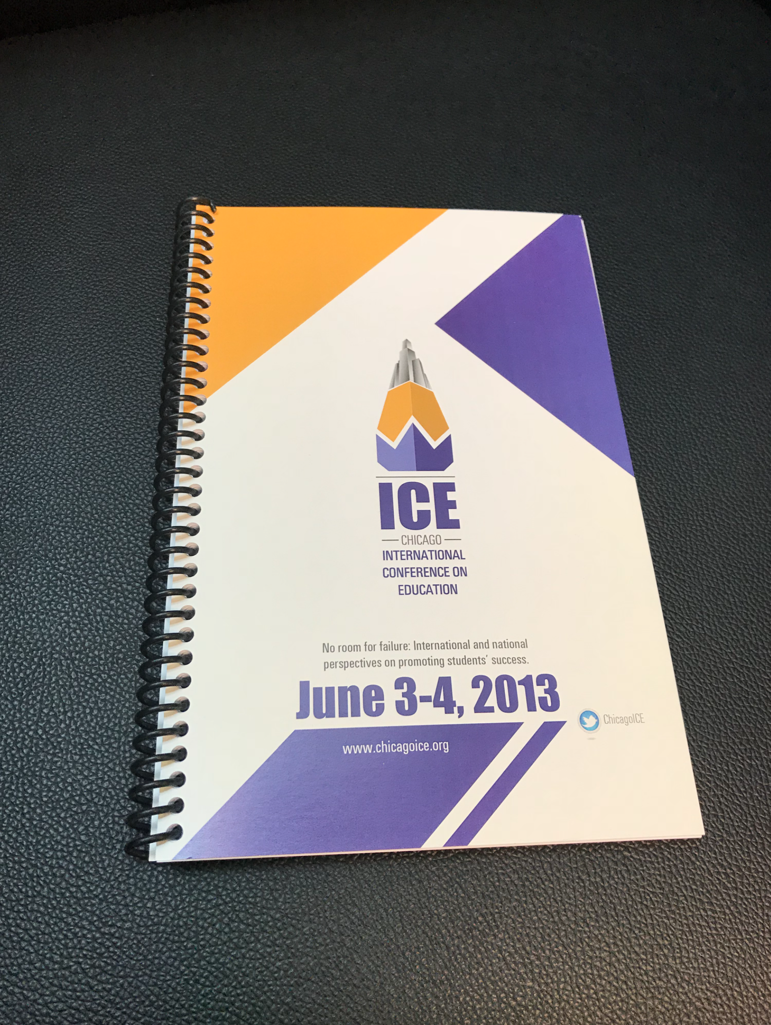
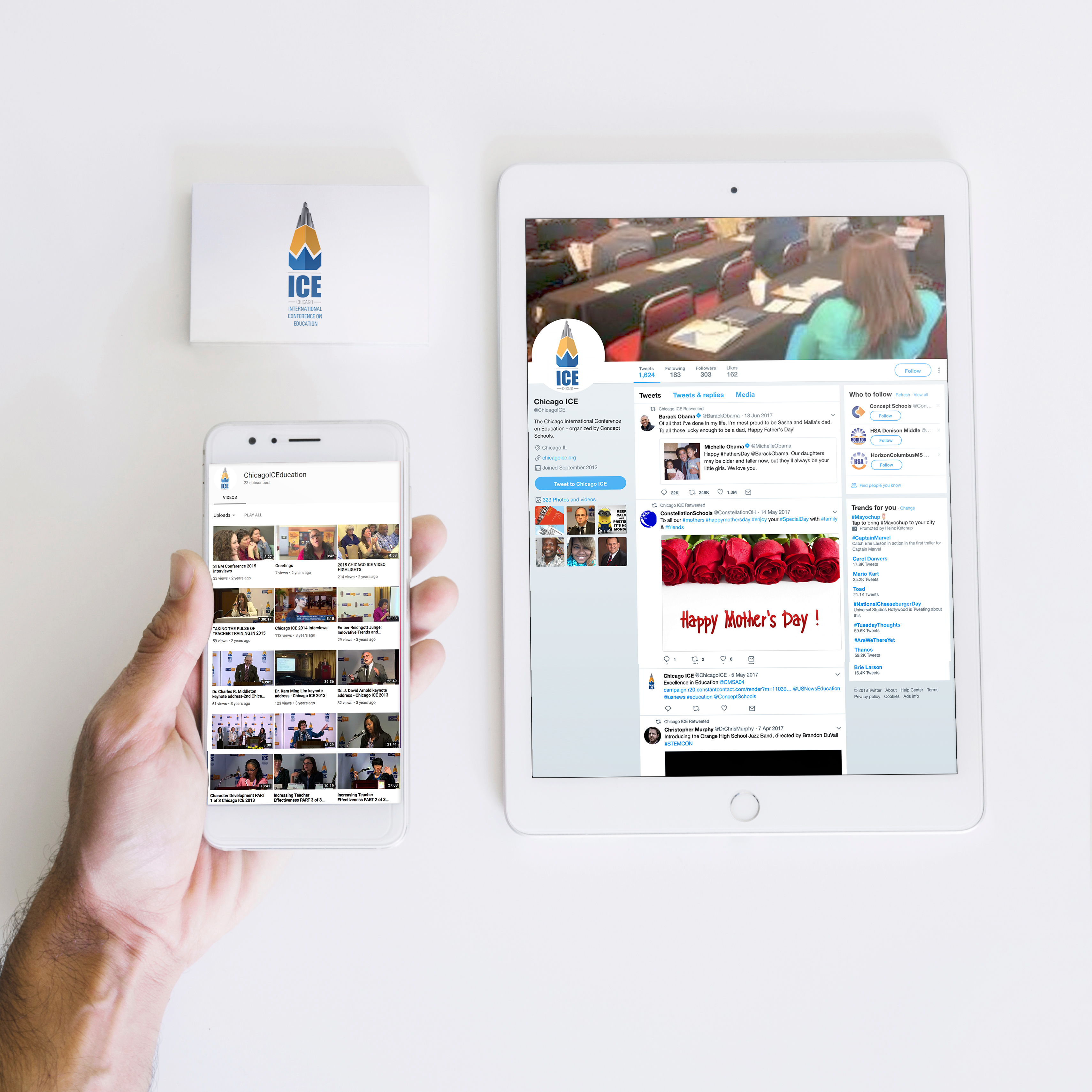
ICE was an international conference on education that drew educators from all around the world to Chicago.With the focal points of Chicago and education, the logo for ICE was designed as a pencil with the led as Chicago’s skyline. The blue and yellow in the design evoke an image of the lakefront of the city. We aim to be intentional in each logo design, and the same is true of the ICE logo. The blue signifies discipline and a strong foundation, a color that is often used in education. The color orange, a blend of yellow and red, gives the energy or yellow and the attraction of red.
CLIENT
Chicago ICE
DELIVERABLES
Photography / Graphic / Web / Video


